The psychology of colour plays a pivotal role in interior design, especially within the realm of luxury real estate. Colours not only enhance the aesthetic appeal of a space but also significantly impact human emotions and behaviour. For architects, designers, and potential clients, understanding the influence of colour can transform a property from merely opulent to profoundly mesmerizing. At CUUB, a creative content studio, we specialize in leveraging the nuances of colour to craft visually compelling and emotionally engaging narratives for luxury real estate. This article delves into the importance of colour in interior design and its role in luxury real estate marketing, offering insights that underscore why our expertise is indispensable.
1. Colour as a Tool in Luxury Real Estate Marketing
In the competitive world of luxury real estate, marketing is not just about showcasing properties; it's about telling a compelling story that appeals to potential buyers' aspirations and desires. Colours play a crucial role in this narrative, as they can evoke feelings of exclusivity, prestige, and comfort. The right colour palette can make a property stand out, creating a memorable impression that lingers in the minds of prospective buyers.
Luxury brands often use specific colours to convey their identity and values. Similarly, in real estate marketing, colours can be used to highlight the unique features and character of a property. For instance, a palette dominated by golds and deep purples can suggest opulence and grandeur, while shades of white and beige can communicate elegance and timelessness. By carefully selecting and applying colours, marketers can enhance the perceived value of a property and create a strong emotional connection with potential buyers.
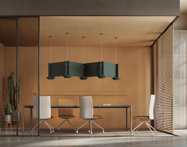
The JEFFREY lamp.
Sweden | Architect: +kouple2. Colour Trends in Luxury Real Estate
Colour trends in luxury real estate evolve continuously, influenced by cultural shifts, fashion, and technological advancements. Staying abreast of these trends is crucial for designers and marketers who aim to keep their projects contemporary and appealing.
Currently, there is a notable trend towards biophilic design, which emphasizes the connection between interiors and the natural world. This trend is reflected in the popularity of earthy tones such as moss green, terracotta, and stone grey, which create a sense of serenity and organic beauty. These colours not only enhance the visual appeal of a space but also contribute to a sense of well-being, making them highly desirable in luxury real estate.
Another emerging trend is the use of jewel tones, such as emerald, green, sapphire blue, and ruby red. These rich, vibrant colours add depth and drama to interiors, making a bold statement of luxury and sophistication. They are often used in combination with metallic accents, such as gold and brass, to create a lavish and contemporary aesthetic.
3. How Cultural Characteristics Influence Colour Choices
Cultural characteristics play a significant role in the selection of colour palettes for luxury real estate. Different cultures associate various meanings and emotions with colours, and these associations can influence design preferences and trends.
For example, in Western cultures, white is often associated with purity and simplicity, making it a popular choice for modern, minimalist luxury homes. Black, symbolizing elegance and sophistication is also widely used in high-end interiors. Or Middle Eastern luxury interiors often feature bold, vibrant colours such as turquoise, deep blues, and rich reds, reflecting the region's cultural heritage and artistic traditions. These colours, combined with intricate patterns and luxurious materials, create a sense of grandeur and opulence.
Understanding these cultural nuances allows designers to create interiors that resonate with the preferences and expectations of clients from diverse backgrounds, ensuring that luxury properties appeal to a global market.
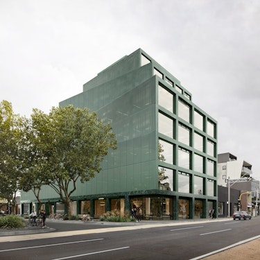
HANDS WELFARE CENTRE.
Seoul, South Korea | Architect: Hands Architects4. The Role of Visual Storytelling in Colour Selection
At CUUB, our approach to colour selection is rooted in visual storytelling. We believe that each property has a unique story to tell, and the colours used in its design should reflect this narrative. By understanding the lifestyle, tastes, and aspirations of our clients, we craft colour palettes that not only enhance the visual appeal of a property but also create an emotional connection with its inhabitants.
Our team of experts combines knowledge of colour psychology with an understanding of market trends and cultural preferences to deliver bespoke solutions that elevate the luxury real estate experience. Whether it's using calming neutrals to create a serene retreat or bold jewel tones to make a statement, we ensure that every colour choice contributes to the overall story of the property.
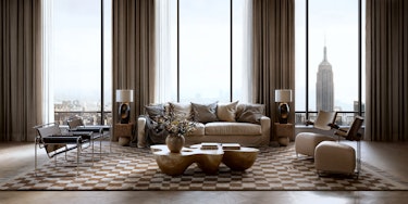
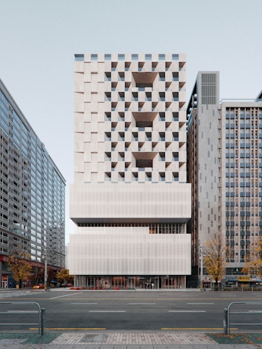
Lux Property.
New York, USA | Architect: Dezest designThe choice of colour in luxury real estate is far more than a mere aesthetic decision; it is a strategic tool that influences perception, emotion, and behaviour. By understanding the psychology of colour, staying informed about current trends, and respecting cultural preferences, designers and marketers can create spaces that truly resonate with high-end clients.